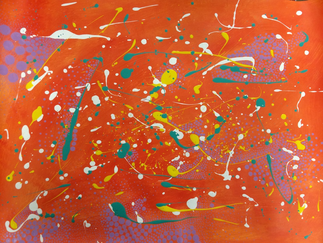
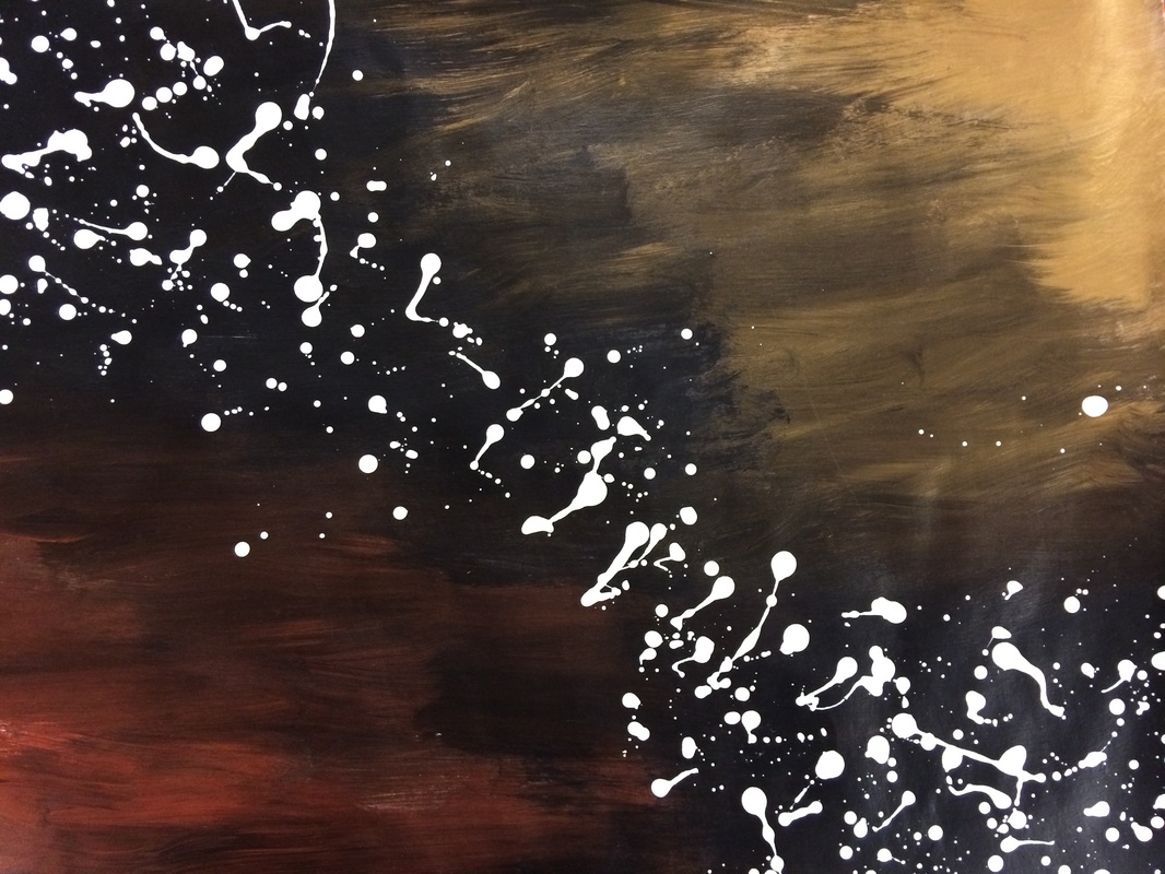
I loved this project. It was great to not really plan something out first, sometimes I think its better this way. The top one is finished, this one is the very bright and in your face one and the bottom one is more subtle. For the orange one I just kind of went for it, I did the splattering pretty quickly and then I took my time on the purple dots. I'm so happy with how it turned out. I don't think the picture does it justice, some of the tiny dots just blend together to look like a blur. I am thinking this piece could be a perfect piece to send for a quality piece. Now to the bottom one, I took more time on the background with this one. When I did my splattering I played off the background and only went diagonally through the middle. I am unsure if I should do more, because I didn't go back in and add dots. But I also like the simplicity of this piece and the starkness of the white. I don't know what color I would use either.
 RSS Feed
